by VMLY&R (GTB)
Art Direction\UX-UI Design
Client: Ford
FORD.DE

BILLBOARS GUIDEBOOK
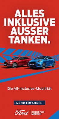
- Definition of guidelines for the German market.
- Definition of optimal fonts for different formats.
- Creating a grid of billboards for various elements.
- Creating lazouts
- Optimization and automation of work processes.
 |  |  |
|---|---|---|
 |  |
Design guidelines are a set of principles that provide designers with a framework for creating effective and aesthetically pleasing designs. These guidelines can cover various aspects of design, including layout, typography, color, and imagery.
Following design guidelines helps ensure consistency and cohesiveness across a project or brand. It also helps to make the design process more efficient by providing a clear direction and reducing the need for constant decision-making.
By adhering to design guidelines, designers can create Hero Billboards for Desktop/Tablet/Mobile formats that not only look great but also effectively communicate the intended message to the target audience.


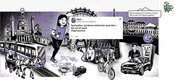
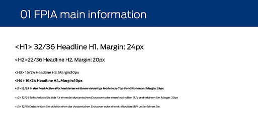
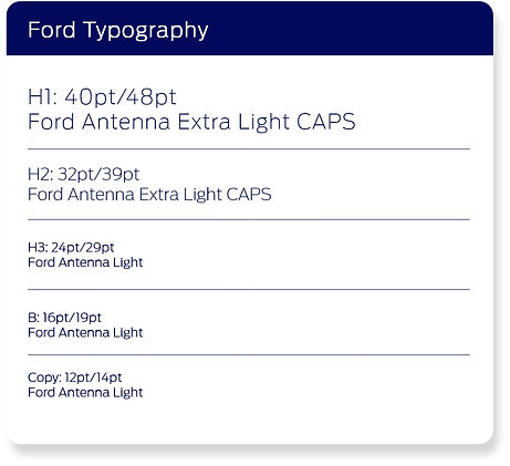
Typography sizes and leading are crucial aspects of designing any piece of text. Typography sizes refer to the size of the font used in a design, while leading refers to the spacing between lines of text. Choosing the right typography size and leading is essential to ensure legibility and readability in any design. If the font size is too small, the text may be difficult to read, while a font size that is too large may make the text appear overwhelming.

FORD BISINESS MAGAZINE
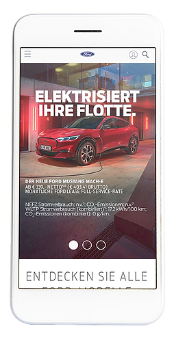
- Creating Layouts for Web.
- Creation of animation ideas and interactive elements for the online version of the business magazine.
- Determining the possibility of antimation, optimization for mobile formats,
- Checking interactive modules.
- Using trending ideas.
An online business magazine with modern animation trends is a powerful tool for delivering engaging and informative content to readers. With animation becoming increasingly popular in the digital world, incorporating modern animation trends into an online business magazine can help capture and hold the attention of the audience.
One of the most popular animation trends in recent years (22/23) is the use of motion graphics with #old school illustrations#. We made it a year before it became a trend! This style of animation involves using moving graphic elements, such as text and icons, to communicate information in a dynamic and engaging way. Motion graphics can be used to illustrate complex business concepts, present data in a visually compelling way, or simply add a touch of creativity to a design.
Incorporating modern animation trends into an online business magazine can help create a memorable and immersive reading experience. Animations can be used to break up long blocks of text, highlight key points, or simply add a touch of visual interest to a design. When used strategically, animations can help deliver complex business concepts in a way that is both informative and entertaining.
Overall, an online business magazine with modern animation trends can help businesses stand out in a crowded digital landscape. By using the latest animation techniques to deliver engaging and informative content, businesses can create a memorable brand experience that will keep readers coming back for more.


FORD SERVICE
- eDM design,
- Organization of components in Adobe XD
- Modular formation
- Creation of gif animation
- Icons rendering
- Image optimization based on the ratio


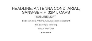


Optimizing email campaigns involves many factors, including the optimization of data weight. Data weight refers to the amount of data included in an email, such as images, graphics, and other elements. Optimizing data weight can help ensure that email campaigns are delivered quickly and efficiently to the recipient's inbox, without being bogged down by slow load times or large file sizes.
Overall, optimizing data weight in email campaigns is crucial for ensuring that emails are delivered quickly and efficiently to the recipient's inbox. By using compressed images, web-safe fonts, responsive design, and plain text emails, businesses can reduce the amount of data included in emails, improve load times, and deliver a better email experience for their subscribers.


FORD DEALER (Germany)
- Creating online Master-Kit for Ford Dealershops (Sketch/Adobe XD)
- Creation of concepts of working modules,
- Checking modules for minimum and maximum values
- Determining working fields, indents, fonts, positions.


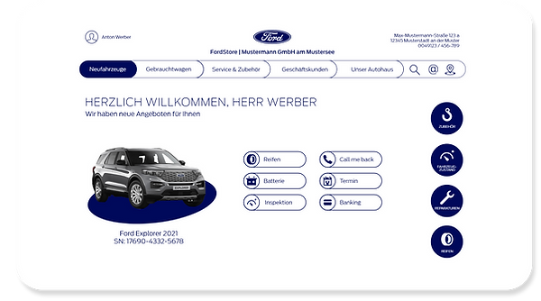
Ford dealer websites are essential for both the customers and the dealerships themselves. These websites allow Ford dealers to showcase their vehicles and services to a broader audience, making it easier for potential customers to find and learn more about the dealership.
One of the primary benefits of a Ford dealer website is that it provides customers with a convenient way to research and compare different Ford models. Customers can browse inventory, view pricing and features, and even schedule test drives all from the comfort of their own homes. This helps potential customers to make informed purchasing decisions before even stepping foot in the dealership.
Additionally, Ford dealer websites can help establish a strong online presence for the dealership.
In today's digital age, having a well-designed website can help build credibility and trust with potential customers. A website that is professional, user-friendly, and up-to-date with the latest information can help establish the dealership as a reliable and trustworthy source for Ford vehicles and services.
Moreover, Ford dealer websites can also provide valuable marketing and advertising opportunities for dealerships. Dealerships can use their websites to promote special offers, discounts, and other incentives to encourage customers to visit the dealership. They can also use their websites to gather customer information and leads, which can be used to create targeted marketing campaigns in the future.


- Upgrading Work Modules
- Update navigation schemes
- Updating the work of CMS

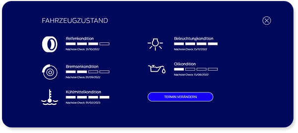
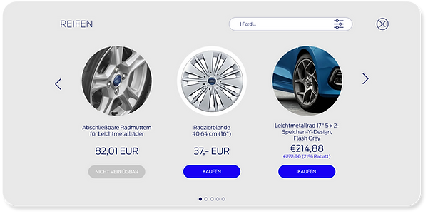
Designing a Ford Dealer Website UI Kit requires careful consideration of various factors, including the brand's visual identity, user experience, and functionality. A well-designed UI Kit can help create a cohesive and user-friendly website that represents the Ford brand effectively and provides a seamless experience for the users.
One important consideration in designing a Ford Dealer Website UI Kit is the brand's visual identity. The UI Kit should incorporate the Ford brand's colors, typography, and imagery to create a consistent and recognizable look and feel across the website. This helps establish the dealership's connection with the Ford brand and promotes a sense of trust and reliability.
A well-designed Ford Dealer Website UI Kit can help create a professional, user-friendly, and functional website that effectively represents the Ford brand and provides a seamless experience for users. By incorporating the brand's visual identity, prioritizing user experience and accessibility, and providing essential functionality, a Ford Dealer Website UI Kit can help increase sales and grow the dealership's business.
FORD DEALER
NEW CONCEPT




FORD MONEY
- Layouts Design
- eDM Design
- Icons consepts for App
- Banners Design
- Video Design


Ford Money is a UK-based digital bank that offers a range of savings and investment products to its customers. The company's mobile app is a key component of its banking services, and its design layouts and icon design have been carefully crafted to provide users with a user-friendly and visually appealing experience.
The app's design layouts are clean, modern, and easy to navigate. The interface is simple and intuitive, with a minimalist aesthetic that emphasizes functionality and ease of use. The app's home screen features a simple navigation menu that allows users to quickly access their account information, view their savings and investment products, and make transactions.
In terms of icon design, the Ford Money app features a range of icons that are both functional and aesthetically pleasing. Each icon has been carefully designed to be easily recognizable and to convey its meaning at a glance. The icons are simple and uncluttered, with a consistent design style that gives the app a cohesive look and feel.
One of the key design features of the Ford Money app is its use of color. The app's color scheme is primarily blue and white, with occasional accents of green and orange. This color palette creates a sense of calm and trust, while also making it easy for users to quickly identify important information.
Overall, the design layouts and icon design of the Ford Money app are a testament to the company's commitment to providing its customers with a seamless and enjoyable banking experience. By prioritizing functionality and aesthetics, the app is able to meet the needs of a wide range of users while also standing out in a crowded digital banking market.
FORD RETAIL


